Are you getting ready to design a logo for your business (or even someone else’s)? Maybe you’re making a logo for your Youtube channel or Twitch streams. Regardless, you need to know how to get started if you want to do it the right way.
Designing a logo isn’t as easy as it looks. There’s a reason that companies pay graphic designers for the perfect logo design.
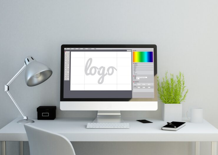
We’re here to talk about four factors that you should keep in mind before you go into your logo creator program. Keep reading to learn more.
1. Basic Color Theory
You don’t have to be a professional artist to make a basic logo, but you should get a grasp of basic color theory so you can understand what you’re doing.
When you’re choosing your colors, you’re actually choosing an important part of your branding. These colors will represent you. It’s not a good idea to have multiple color schemes when you’re first starting out.
You want to pick colors that contrast well enough that the logo is obvious from a distance. You wouldn’t want to pick light blue and mint, for example, because there won’t be enough of a distinction.
While you don’t have to choose exact complementary colors, look at a color wheel to see which colors will be different enough that your logo will pop.
2. Recognition
Speaking of “popping,” how recognizable is your logo?
You don’t want something too minimal or basic (unless minimalism is part of your brand). Remember, brand recognition is a big deal. You want customers or viewers to see your logo and know who it’s associated with.
Try to make a creative design instead of using pre-made clip art or stock designs. This is one of the reasons that people hire a professional designer; not everyone is an artist.
If you use a logo maker online, it’s easy to make basic logos with templates. That said, try to make sure that you’re not copying someone else.
3. Overall Visibility
How visible is your logo from a distance?
As we mentioned when we discussed color, you want to make sure that people can see and read your logo even when it’s not up close. While color helps, you also have to consider any pictures or writing on your logo. Is it too small for someone to recognize?
This is going to be a trial and error process. Test out everything that you’re going to use your logo on. If you use a logo for a sign, it should still work as an icon or sticker.
4. Aesthetic Appeal
If you want to make merchandise with your logo or use it for social media, you need to make sure that it’s aesthetically pleasing.
Consider how some brands (even major corporations) have been updating their logos. They switch to designs that are more streamlined and sleek because that’s what’s popular right now.
If you want an attractive logo, take tips from the companies who do it best.
Designing a Logo: More Complicated Than You Think
While designing a logo can be a lot of fun, you still need to factor in specific design qualities and elements if you want it to be successful. Learn how to design a logo in a logo maker by practicing mock-ups or “for fun” projects before committing to your professional logo.
For more articles all about design, marketing, and more, visit the rest of our site.